
Quite often I get attracted to logos of companies, and wonder what they had in mind while getting it designed? Logically, it must be to attract and impress the respective target segment and build the brand. But is it always so? Or does it showcase the philosophy, an anecdote, a brainwave, or uniqueness of the company or product?

Interestingly, the Apple logo went through a number of changes over time since the 70’s, starting with ‘apple’ symbolizing knowledge, with use of Sir Isaac Newton and the gravitational pull. The logo next became more focused on the fruit itself, with introduction of the rainbow apple as it was the uniqueness of Apple computers at the time to show coloured images. Bitten off from one side could indicate a bite (or byte) of knowledge taken by those using the brand. The current logo is colourless, neither black nor white—which should motivate the White House, and sensitize the US government, at least post-Floyd protests.

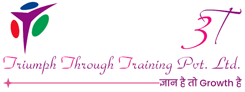
Likewise, the 3T (Triumph through Training Pvt Ltd.) logo represents the depth of cognition, as it stands for knowledge sharing, contributing to talent development. The three wings represent creation of new knowledge, sustenance and application of it, and destruction or unlearning of the obsolete kind. The three leaves symbolize the continuous and harmonious development of body, mind, and soul through interventions, to enable individuals and organizations achieve their goals and vision. And finally, the zing about colour psychology and marketing being—red would ensure materialistic gains, green signifies happy relationships at personal and professional levels, and indigo suggests growth in wisdom.
So, the next time you are eating at Nandos or having a coffee at Starbucks, be curious to find the logic or emotion behind it…
